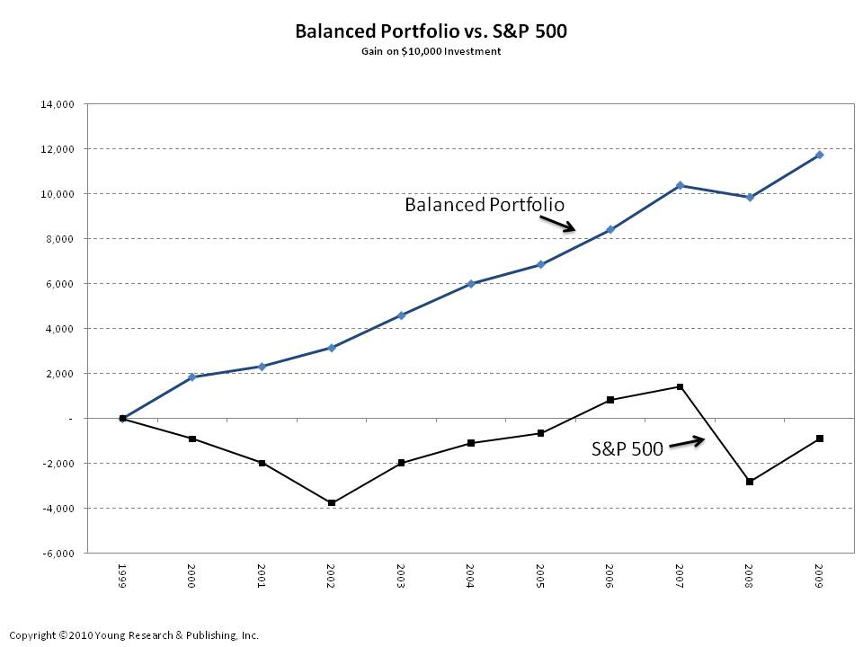
Given a choice, most investors would rather own the portfolio represented by the blue line in my chart. But in reality, many own something closer to the portfolio represented by the black line. The black line tracks the performance of the S&P 500. The blue line tracks the performance of a balanced portfolio. The balanced portfolio is invested 30% in corporate bonds, 30% in intermediate-term treasuries, 30% in equities, and 5% each in gold and the Swiss franc. The balanced portfolio is also rebalanced annually.
Over the last decade, my balanced portfolio earned a compound annual return of 8.07%, compared to a compound annual loss of 0.95% on the S&P 500. And the higher-returning balanced portfolio was much less risky than the S&P 500. The standard deviation of my balanced portfolio was only 5.5%, compared to 21.1% for the S&P 500—that’s three times the risk for a negative return. Sound like a compelling opportunity to you?
The S&P also had more down years than my balanced portfolio. The index was down four out of the last ten years. In down years, the average loss was 20%. My balanced portfolio had one down year, and the loss was only 2.63%. The contrast between the two portfolios is stark. The balanced portfolio is the hands-down winner in terms of return and risk. Of course, over many decades one should expect a buy-and-hold equity-only portfolio to outperform a balanced portfolio, but for conservative investors, and those in or nearing retirement, the added volatility is often not worth the prospect of additional return. I invest with a balanced approach and advise the same for you.


